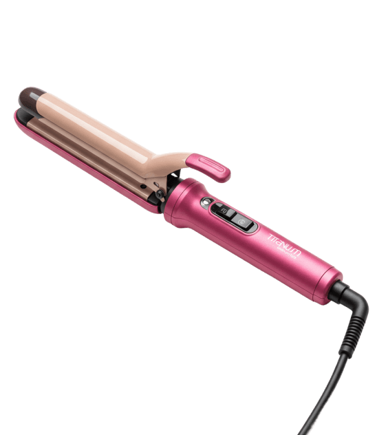
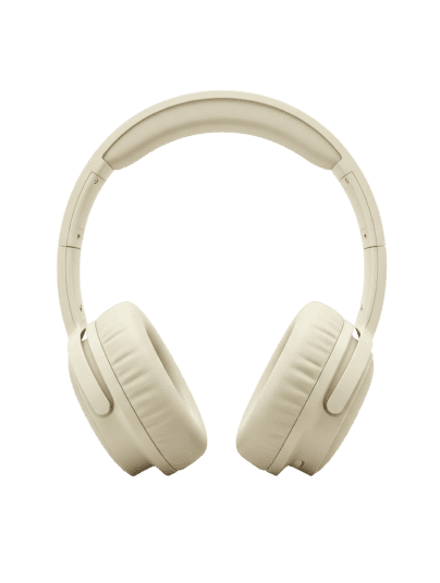
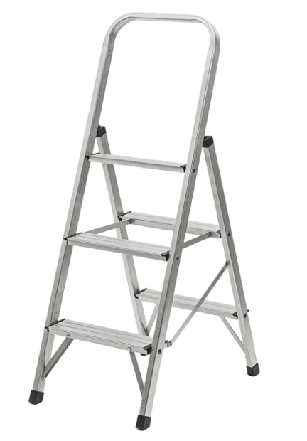
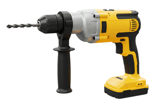
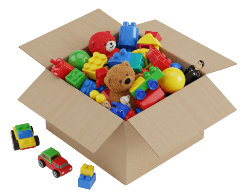
Turn your neighborhood into a shared marketplace.

Reimagine ownership,

Reconnect with our neighbors,

Restore the planet.

Design for Sustainability

Peer-to-Peer Rental Experience

Trust-Driven Design

See how it’s live !

See how it’s live !

Overview

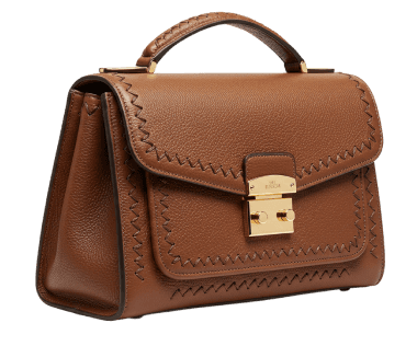
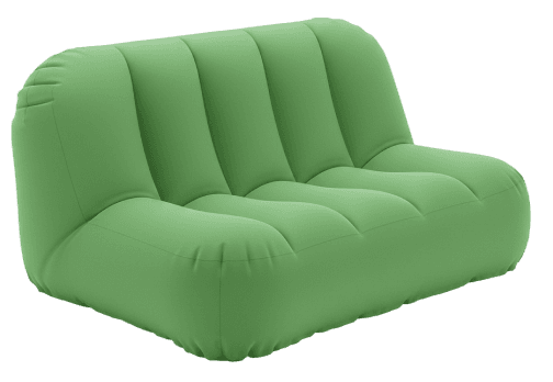
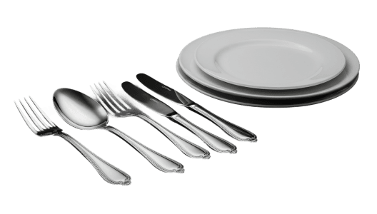
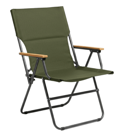
Nearville is a peer-to-peer rental platform that makes borrowing safe and easy for Gen Z.

Nearville, Founding Product Designer (June 2025 – Present)

I joined Nearville as a founding product designer just before our MVP launch, drawn to the mission of helping neighborhoods thrive through meaningful and trusted sharing.


Since day one, I’ve been leading the design of our website, onboarding experience, and full rebrand, working closely with engineers, marketers, and our CEO to bring it all to life. We’re now live in market, and I’ve been juggling this work alongside grad school (somehow!).


What drives me is collaboration and speed. I move fast, test often, and care deeply about both clarity and craft. Lately, I’ve been leading user testing with college students to validate our flow and sharpen what comes next.

ROLE

ROLE

Founding Product Designer – UX Strategy, Visual Design, Rapid Prototyping, User Testing

Founding Product Designer – UX Strategy, Visual Design, Rapid Prototyping, User Testing

TEAM

TEAM

Design team

Design team

TOOLS

TOOLS

Figma, ProtoPie, Midjourney, ImageFX

Figma, ProtoPie, Midjourney, ImageFX

TIMELINE

TIMELINE

2025.5– Present

2025.5– Present

Takeaway

This experience strengthened my ability to communicate and collaborate across disciplines, while exploring how personal health data could meaningfully support users’ daily routines. Currently, I’m applying these skills as I lead user interviews with 20+ college students and conduct prototype testing at UW and Rutgers. We’re moving fast with iterative cycles to sharpen our product experience.

The main colors, orange and blue, reflect the vibrant energy of creativity. Orange symbolizes enthusiasm and action, while blue conveys trust and professionalism.

The typography uses Poppins for its clean and modern style, ensuring readability and a professional yet

approachable look.

KPT Retrospective

We are currently conducting interviews with 20+ college students to uncover key insights and have begun prototype testing at universities like UW and Rutgers. I’m currently leading rapid iterations based on real user feedback and as a builder of this product, I’ll continue testing, validating, and improving at speed to ensure we’re moving in the right direction.

The main colors, orange and blue, reflect the vibrant energy of creativity. Orange symbolizes enthusiasm and action, while blue conveys trust and professionalism.

The typography uses Poppins for its clean and modern style, ensuring readability and a professional yet

approachable look.

Keep

Collaborating effectively within a cross-functional, global team, including international engineers and marketers, and getting strong feedback for clear communication and visual execution.


Taking initiative in shaping design processes, leading onboarding and branding with a structured, fast-paced approach.

Problem

As a rental platform, building trust and ensuring user safety is a core challenge. Designing for emotional reassurance and practical safeguards became a central mission throughout the UX journey.

Try

Implementing trust-centered UX features through continuous user testing and field interviews.

Always opened to have a coffee chat:)

+1 (931) 626-6737

TEAM

Design team

ROLE

Founding Product Designer – UX Strategy, Visual Design, Rapid Prototyping, User Testing

TOOLS

Figma, ProtoPie, Midjourney, ImageFX

TIMELINE

2025.5– Present

Create a free website with Framer, the website builder loved by startups, designers and agencies.